Windows and Mac Vertical Scrollbar needs UI improvement
d
da_kicks_87
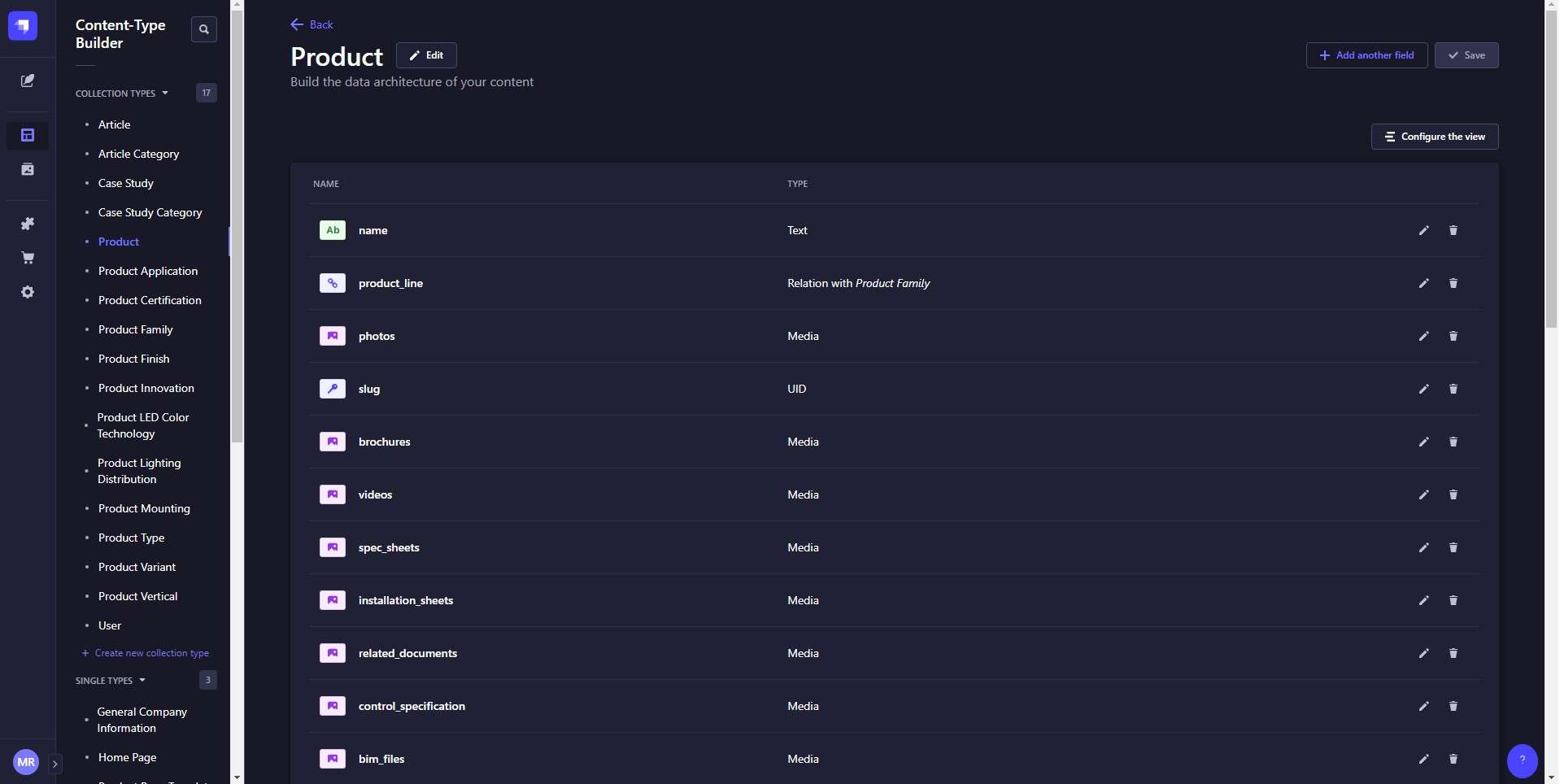
When having many Collection types in the Admin a vertical scrollbar appears. It is currently using default browser styling.
On Mac it doesn't look too bad, but on Windows it just doesn't fit with the modern Strapi UI. It looks too bold and out of place. Both Mac and Windows Strapi’s vertical scroll should look the same.
I feel it would look better if the vertical scrollbar is thinner, and behave like the Discord app's scrollbar. It would only appear when user hover over the list of collections.
See screen shot of the vertical scrollbar on Windows.
I suggest this get fixed and implement in a future release.
In the meantime is there a temporary work around to style the Admin UI?

d
da_kicks_87
More thoughts on this.
In dark theme mode, the vertical bar doesn't change to dark color.
See screen shot of comparison of Windows dark theme Strapi Admin vs Windows Strapi User Guide dark theme .
The Strapi User Guide dark theme's vertical scroll bar looks significantly more appealing.